We’re pretty confident that most of you have Facebook/ Twitter accounts, if not both that you probably use on a daily basis. However, how many of you actually have an active G+ account? We’re betting not many, except for those that don’t like mainstream or are very tech oriented even though Google now boasts more than 170 million users since its 2011 launch.
As you have noticed this morning, G+ has a fresh new “clear white” interface!
While many users have been having quite a laugh at this “white space” (Link) it’s even a trending topic on the social network, makes us wonder if this was a deliberate intelligent act from Google to finally spark a conversation. Nevertheless, if you really cannot handle so much “white” staring at you, here’s a temporary fix. It will adjust the CSS to eliminate if from your screen and when Google updates and places new functionality there the update will show.
The new features:
Navigation
Instead of the static links at the top of your account, you can now modify applications through a dynamic ribbon on the left hand side of the page. Some of the benefits cited by Google are:
- Drag apps up or down to create the order you want
- Hover over certain apps to reveal a set of quick actions
- Show or hide apps by moving them in and out of “More”
- Set up for future features in a clutter-free environment
Account Management
Google has changed the way you switch from a personal account to a page account. There are now three places to find a page:
- Use the account switcher in the Google Bar
- Click the Pages icon on the left navigation ribbon
- Hover over the Pages icon on the left navigation ribbon
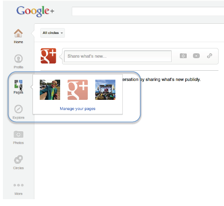
Drag pages to your Navigation ribbon to make it easier to switch accounts
Brand Page Profile
A very obvious change to brand pages is the option of adding a panoramic banner at the top of the page (this is suspiciously similar to Facebook’s Cover Photo for Timeline). Brands can now choose from the five separate scrapbookimages, or this one panoramic.
If you have added scrapbook images already, they are automatically transferred to the new format. However, if you have not added these images, your profile will have a black image with blue and red bubbles as a placeholder.
- Panoramic Cover — 940 x 180
- Scrapbook Images — Five 110 x110 images with 16 pixels between each
- Profile Image — 250 x 250
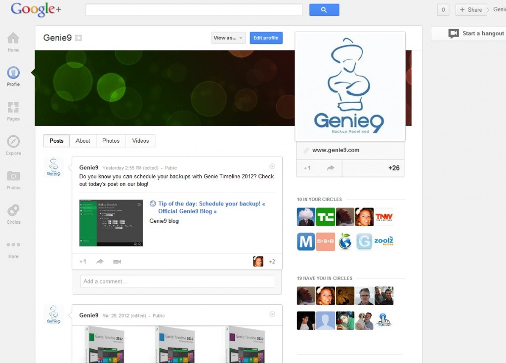
The Genie9 Page before its upcoming new & exciting panoramic cover
Stream Layout
Changes to the stream are the most apparent, and were made so that Google+ can better showcase personal and brand experiences and allow users to see and join conversations. The major changes are:
- Larger photos and videos
- More obvious conversation and activity
You can now simply click on the bottom right corner of any activity to view an expandable drawer with all the +s and comments
Hangouts
Google created a dedicated Hangouts page were users can find any public or On Air Hangout that is taking place at that time. This may help to increase viewership for brands that are hosting Hangouts.
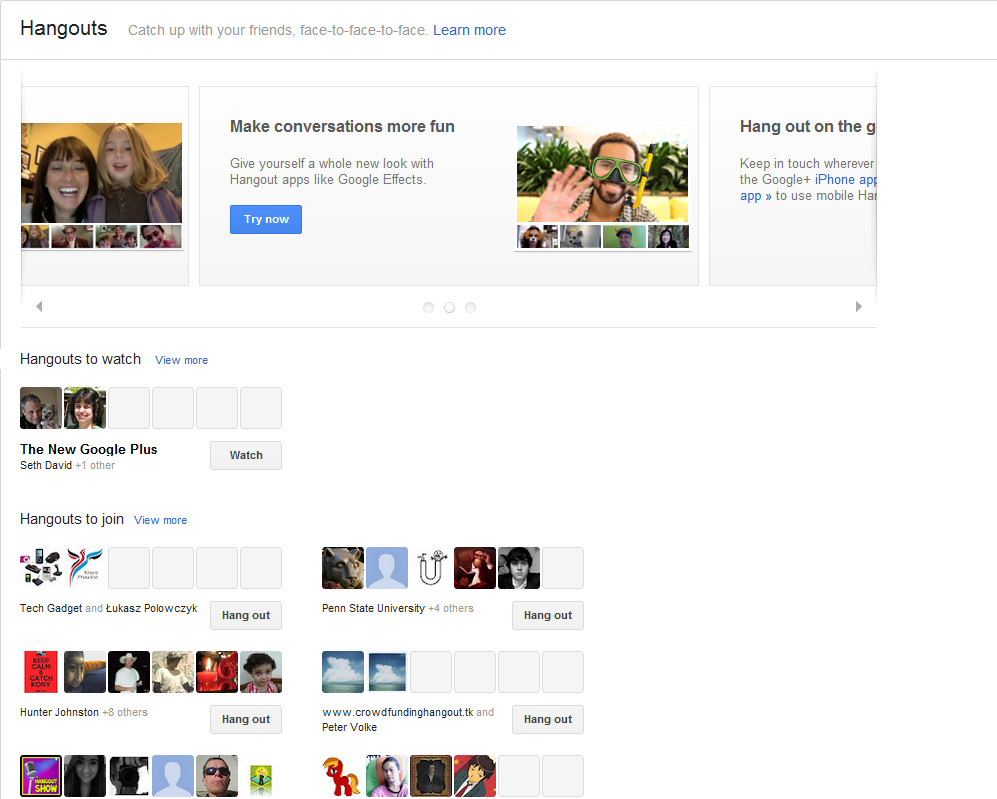
The New Hangout Page
Finally, we leave you with a video explaining it all in brief. Enjoy! (Video)
![]()
Looking for a simple, elegant backup solution?
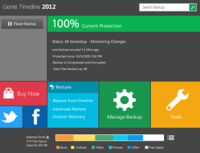
Genie Timeline 2012 is a new version of the number one continuous data protection program Timeline 2.1. It offers the first metro style user interface; enhanced performance, and added features. Like us on Facebook and Follow us on Twitter for the latest news.
>Follow @Genie9backup
![]()
